


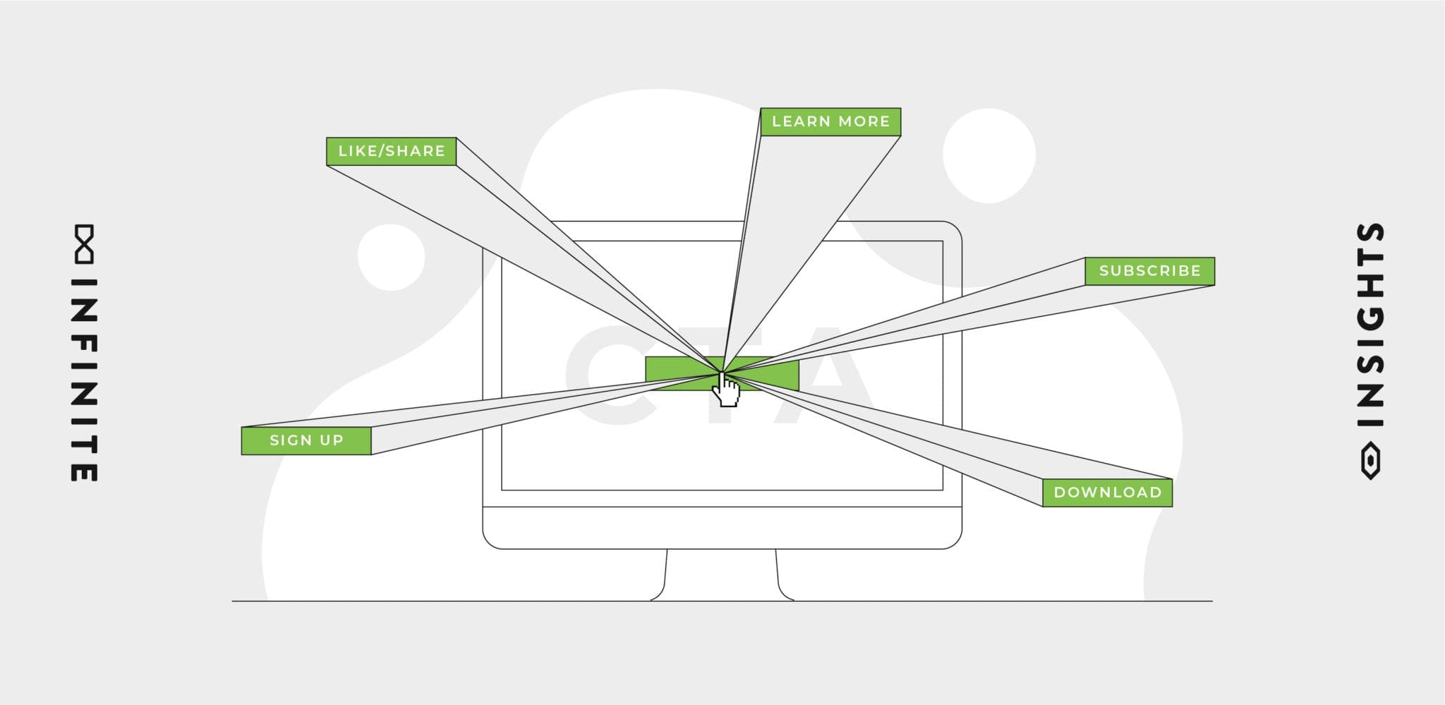
Call-to-actions are one of the most critical elements of an advertisement. Their message tells your audience what action to take next and helps them along the sales funnel. Without them, consumers would have no idea what action to take.
“Learn More.”
“Sign Up Today.”
“Try it For Free!”
While these basic call-to-actions speak directly to the end goal of an ad, they are unlikely to convert would-be consumers.
We’ve found that tweaking your ad copy even slightly can drastically change consumer behavior.
Instead, use these adaptable tips to carefully craft a call-to-action that urges consumers to take action. The difference could be between a scroll and a click!
1. Don’t Let It Be an Afterthought
From a 30-second spot, to a promo display banner, every ad has a story to tell. We spend hours carefully crafting our perfect headline or script… only to drop in the usual go-to CTA?
CTAs shouldn’t be treated like legal, or a copy and paste. There is an opportunity to continue your narrative. Let your CTA be an extension of your copy, or something your audience wants to click on because they need to know what will happen next. It should tell them how they can make the next move to become a part of the story.
If your CTA is online, this tip is doubly important, as the anchor text (button text) will signal to readers and Google what the next page is about. Avoid using “learn more” or “download” language, which are bland and unintuitive. Instead use compelling verbs such as “start a quote” or “get the ebook” to increase your click-thru-rates.
2. Speak to Your Individual Audience Members
Even when a simple CTA is required, there’s always an opportunity to speak to your potential customers. Sometimes this is as simple as going from “Start Free Trial” to “Start Your Free Trial.”
Although our goal is always to get millions of eyes on an ad, you can still make your viewer feel like the brand is only talking to them.
3. Include the Benefit
What is your audience getting out of this brand? A CTA may only be a couple of words, but how can we reassure someone that the intentions are in their favor? When a viewer clicks on a CTA, they are one step closer to beginning their story with it.
When they know what’s in it for them, they’ll be ready to know more.
4. Make an Offer, But Make it Interesting…

You’re offering something to a consumer, so take your copy beyond “TRY IT.” Yes, the rest of the ad will speak to what they’re getting, but why not wrap it up all in one and let them click directly on what they want.
It’s not just “Get one FREE” it’s, “Get Your Free Smoothie.”
5. Don’t Let It Blend In

Design is key when it comes to successful CTAs. When we have the opportunity to create your button from scratch, we take advantage of the brands contrasting colors. Don’t be afraid to make it pop, your audience needs to know exactly where to go next.
Even when guidelines require simple copy, creating an eye-catching design with animations can help bring in the clicks.
Your call-to-action buttons should appear “clickable” by visitors and be easy to find. To accomplish this, consider the background negative space, button color, text size, and border color.
6. Consider Your Ad Location
Where you place your button or CTA will greatly determine the number of clicks your ad receives. Eye-tracking research performed by Nielsen Group, discovered that users scan pages in an F-shaped pattern while browsing articles.
This means that simple CTAs above the fold, or upper half of the page, will perform better on average than CTAs buried in the article. Complex CTA should typically be placed towards the end of a page/article, so consumers are fully informed about your offer.
Key Takeaway
At The Infinite Agency, every hour and every pixel that goes into creating your brand’s identity is crafted with your purpose in mind. Even though a CTA may seem like a very minuscule piece of the puzzle, it is a part of your story and we’re here to use our knowledge and passion to help you tell it confidently from headline to call-to-action.