The long and short of it is, yes but with some careful guidelines!
Popups first showed up in the late 90s on a site called Tripod.com and were originally designed as an alternative to banner display ads, which advertisers worried could be accidently placed on explicit websites. Because of that fear, a more controlled solution was born.
In no time at all, agencies flocked to the new medium. Unavoidable, attention-seeking ads? I mean, what marketer could resist that sort of temptation?
You know the end result. Fake cancellation buttons, misleading ads, fishy redirects and opening new browser windows, caused consumers to quickly lose trust in clicking popups, plummeting their value to advertisers/webmasters.
So why would I possibly advocate their use in 2020?
Because consumer trends have changed dramatically in the last few years. Today’s consumer prefers a personalized advertising experience, with emails and offers tailored to their unique needs.
This gives popups a renewed purpose, since they are great for collecting sales information and helping users navigate to relevant content elsewhere on your website. But don’t just start adding popups without a strategy. There are some strict rules we suggest you follow to limit traffic bounces and maximize your conversions. Here are our agency’s best practices for adding popups to a website.
Determine Which Popup you Should Use
- Standard Popup – Your classic middle-of-the-screen popup. Useful for driving traffic to key converting pages.
- Lead Generation – Grow your subscriber email lists and send visitors useful content periodically, typically displayed on blog or content pages.
- Promotion/Offer – Advertise your latest special to visitors.
- Login Forms – Help users login to your website with a popup modal and save them an unnecessary click.
- Exit Intent – Last ditch effort to motivate users before clicking off your website. Exit popups normally have persuasive captions and offers that take up the full-screen.
- Welcome Mat – Greet users with a full-screen message the moment they visit your landing page.
- Cookies Notification – Notify visitors about your cookie collection policy, usually unobtrusive and located near the top or bottom of a web page.
- Hello Bar – Display company announcements or offers above your menu navigation.
Make Your Popup Feel “Designed”
It sounds obvious right? Well, we’ve seen too many websites ignore this step!
Your popup should never feel off brand or disjointed from your website’s overall design. Be sure to keep consistent colors, typography, and tone with your popups and limit opening new windows or redirecting users. If you’re still building your website, include a visual of your popup in your wireframe mock-ups. That way it remains cohesive with your site design from the start.
Let’s look at keyword tracking giant SEMRush for a real life example. Their recent article, biggest SEO mistakes, features a minimalist popup design that appears from the side rather than in the middle-of-the-screen, giving their readers room to still browse the article.
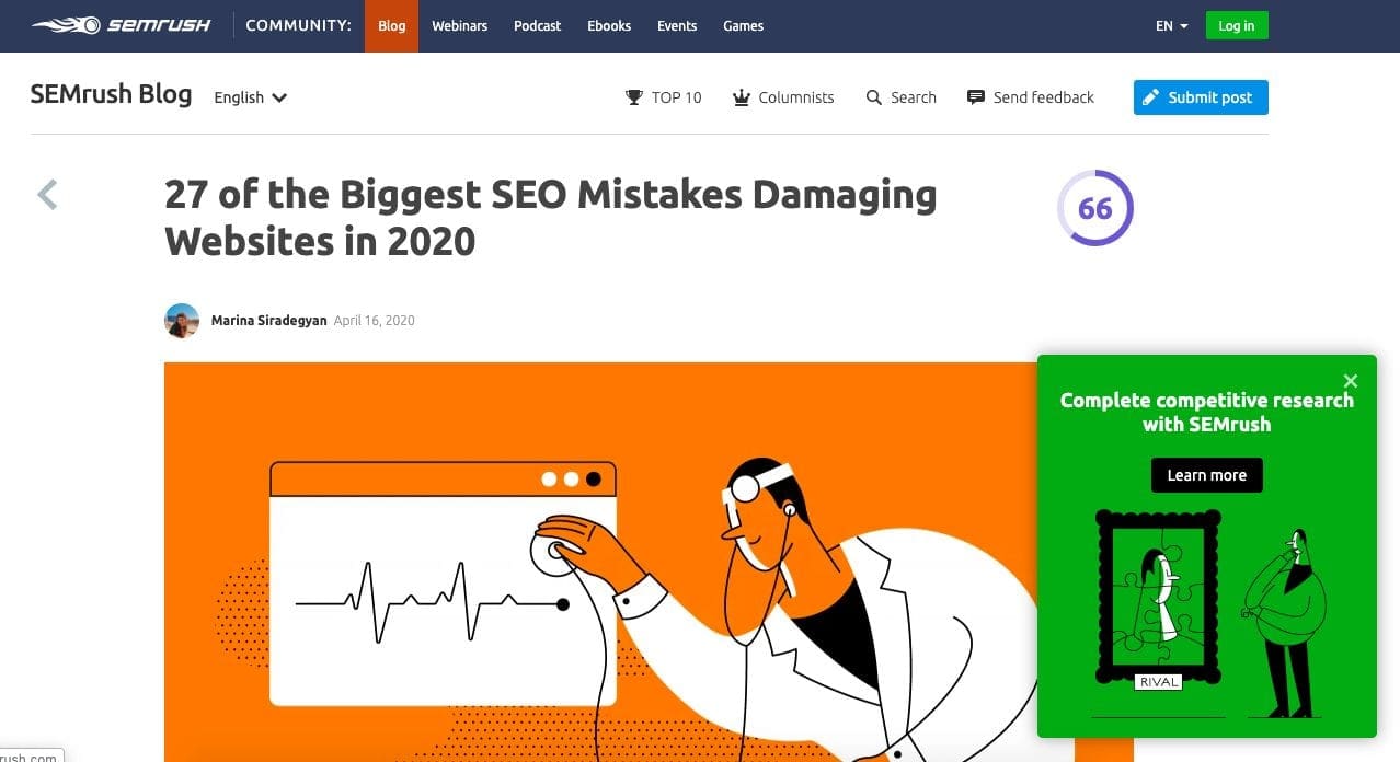
The popup does a great job of feeling cohesive with the overall art direction of the article and brand. The illustrations and bright colors create a very cohesive experience. If you recall our earlier mention of personalizing your ads, you can also see that SEMRush’s popup drives users to relevant SEO content, which is valuable to readers of this article.
Now let’s look at a less than ideal example on Shutterstock.com.
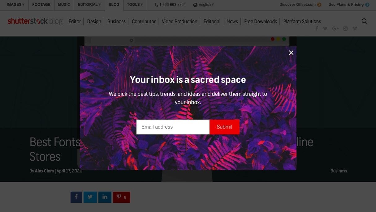
This popup is quite busy and can be hard to make out for those with poor eyesight. The darkened background while normally recommended, gets lost with the border of the ad.
But the thing I dislike most about this ad is that it feels like an afterthought. The popup image has no relevance to the popup, article or brand, and that copy is pretty uninspired too. When compared to the rest of Shutterstock’s brand imagery, it truly feels out of place.
It’s important to remember, as a webmaster, your job is to always provide a quality user experience, which also means thoughtful design of your popups.
Give Readers Space To Browse
Imagine you’ve entered a new retail store. Before you even begin to browse… BAM! An eager employee asks you to buy something right then and there.
It would probably irritate you right? The same can be said of “immediate popups”.
You need to balance the timing of your popup. Launch too quickly and you interrupt your readers. Too slowly, and you risk readers exiting your page.
Best practice dictates that popups appear after a user has had time to browse. For some sites that could be 20 seconds. Others, 1 minute or longer. It all depends on how users interact with your website.
To determine how long you should wait, hop into Google Analytics and review your average time on page for your popup location (Reports > Behavior > Site Content > All Pages > Time on Page).
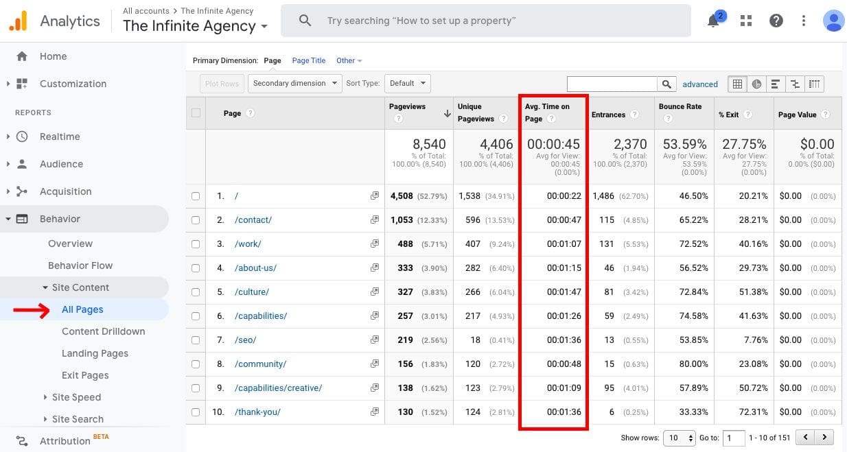
Once you’ve discovered your time, you’ll want to configure your popup to launch right before users leave the webpage (also known as an exit). While this may seem long, you’re actually giving users enough time to read and comprehend your content.
This delay allows prospects to become invested in your content, builds brand credibility, and increases the likelihood of them converting with your popup.
One last detail to consider is the frequency of popups. To avoid pestering readers, your developer should disable recurring ads, ads shown to existing customers, and reshowing ads that have been cancelled by the user. This way, your messaging can stay focused on enticing new leads, versus retaining current customers which requires a different strategy.
Write Attention-Grabbing Headlines & Clever Copy
Just like the rest of your website, your popup should have clear and concise messaging that tells users exactly what to expect before clicking.
Think of writing them similar to writing effective CTAs. Your popup should include command verbs, product benefits, 1-2 sentences max, strong visuals, and descriptive button text in the design. By incorporating these elements into your popup, your users will feel more confident in clicking your offer.
Checkout how news site Search Engine Land, highlights the SEO benefits of signing up for their email newsletter. The messaging is heavily geared towards the end user. “Boosting visibility” is extremely relevant to a SEO article about increasing traffic and would be enough of a reason for most people to join their email list.
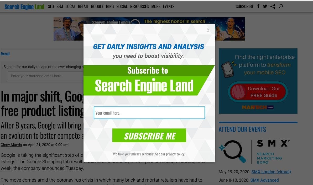
Whether it’s up-selling products, showcasing related articles, or asking for email subscribers, you should write deliberate popup copy that evokes interest and give reasons for users to click.
Now that you understand the best practices for adding popups, it’s time to create your first Elementor popup!
How to Add Popups to Elementor
We’re not afraid to admit we’re huge fans of Elementor. Their popup builder offers design flexibility.
To get started, make sure you have both Elementor AND Elementor Pro installed on your website.
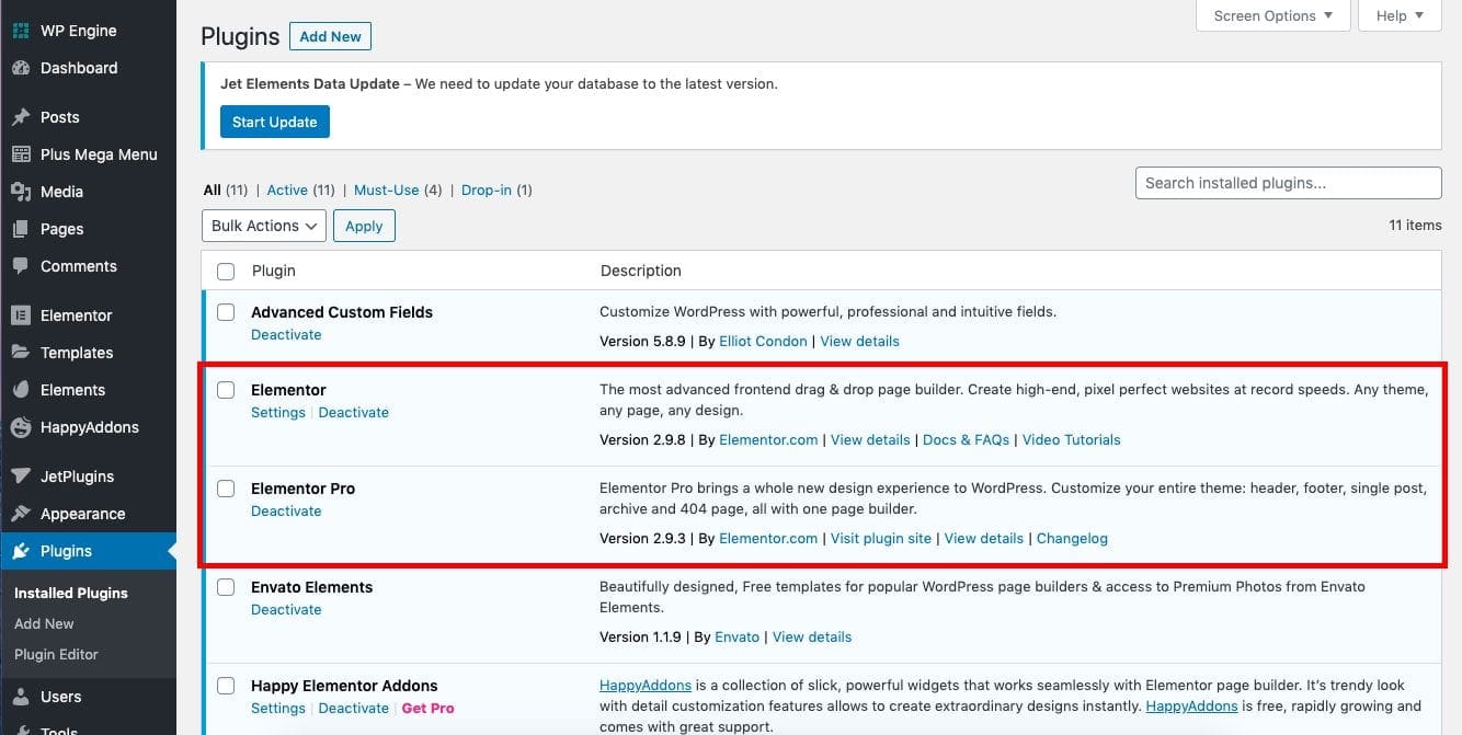
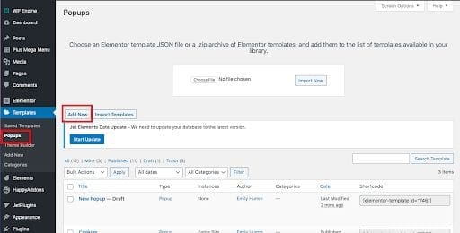
Once you have them both activated, head to the “Templates” section beneath Elementor. From there, click “Popups”, then “Add New”.
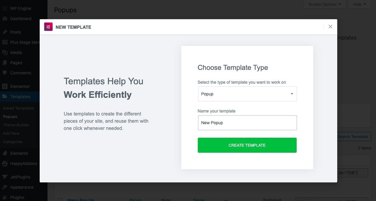
An Elementor portal will appear and ask you to select a template type and label your template. Leave the template field as “Popup”, and name it something you’ll remember. Then hit “Create Template”.
You’ll be redirected to your normal page builder editor, this time with some suggested popup designs created by the Elementor team. As of this post, Elementor offers 128 different popup templates for premium users to customize.
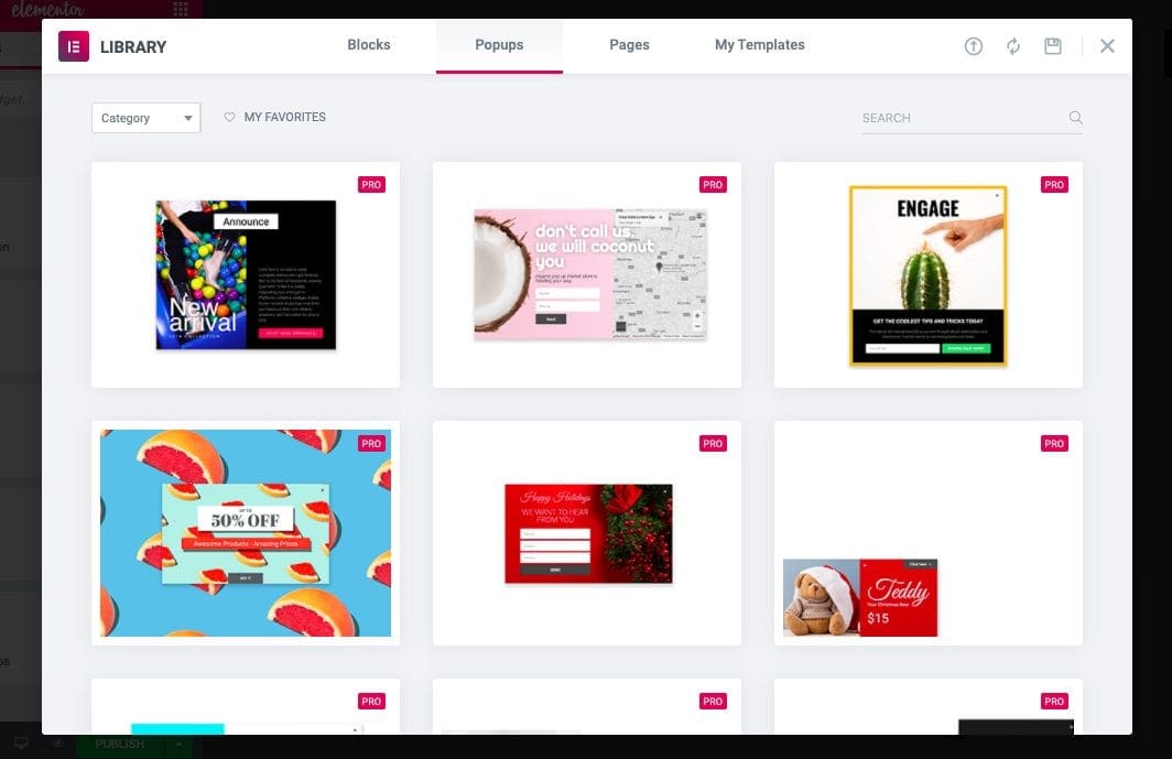
For the purpose of this article though, I’ll select a premade template, but know, like their normal page builder, you have complete creative control on the design of your popups. Feel free to tinker and create your own before proceeding.
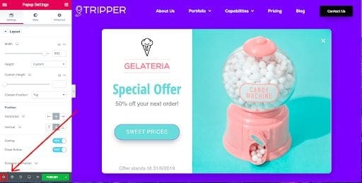
Once you’ve added all of your elements, click the “Settings” button in the bottom left corner of the page builder to add the finishing touches. In this dashboard, you can set popup width, entrance and exit animations, background overlay color, and more.
Now tab over to the “Advanced Settings” section. Here you can set popup close actions such as closing with the escape key, preventing scroll, and avoiding multiple popups.
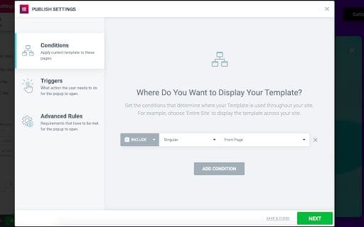
Once you have a final design you’re happy with, click “Publish”. You’ll then be asked where to display your popup, known as “conditions”. You can choose to display it on individual posts, pages, or the entire site.
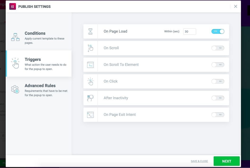
Your next setting is “Triggers” or what action users must take before seeing your popup. Elementor allows you to cause your popup to appear after one or multiple triggers occur. These include:
- Page duration – set the number of seconds to wait before launching
- Scroll distance – set number of pixels or percentage scrolled before launching
- Scroll element – launches popup after scrolling past a specific element on the page
- Clicking – user must click a specific button or element on the page
- Inactivity – launches popup after a user takes no action for set amount of seconds
- Exit intent – uses mouse activity to launch a popup right before a user tries to exit your website
Your last setting is the “Advanced Rules”. This is where you can prevent customers and new users from seeing the same popup twice.
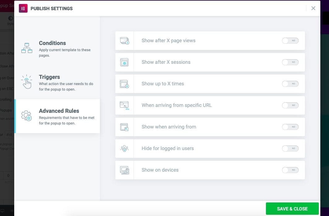
After you’re done, click “Save and Close”. That’s it! Your Elementor popup should be live and working!
Key Takeaway
While originally a major nuisance, nowadays popups can actually enhance a user’s experience and drive meaningful conversions. Whether you’re using Elementor or another plugin, remember to keep your popups relevant to the page content, seamless with the design, and provide value to the reader’s browsing experience.
